
A well-designed facility dashboard transforms raw operational data into actionable insights, giving managers a real-time view of utilization, revenue, staff performance, and customer patterns that drive better decisions. When you can see at a glance which fields are underutilized, which instructors are fully booked, and which payment invoices are outstanding, you stop reacting to problems and start preventing them.
This guide walks through what makes an effective baseball facility dashboard, which metrics actually matter for profitability, dashboard design principles that work for facilities (not generic businesses), common mistakes to avoid, and how to choose dashboard features that fit your operation.
Key Takeaways
- Prioritize utilization by field and time block, revenue per hour, and booking patterns over vanity metrics
- Real-time visibility prevents double bookings and fills every open time slot
- Match dashboard design to facility type: youth leagues need different insights than adult rentals
- Unify scheduling, payments, and customer data in a single operational view
What Is a Baseball Facility Dashboard?
A baseball facility dashboard is a centralized visual interface that aggregates key operational and financial data from your booking system, payment processing, scheduling software, and customer database into one real-time view. Instead of logging into three different systems and pulling five separate reports to answer basic questions about your business, you see everything critical in one place.
The difference between a dashboard and standard reports matters more than most operators realize. Reports are static snapshots pulled periodically: a weekly revenue report, a monthly utilization summary, last quarter's instructor performance.
Dashboards provide live, continuously updating views of what's happening right now: current bookings, today's revenue, this week's field-by-field utilization. According to the Nielsen Norman Group, dashboards are single-page visualizations built for at-a-glance understanding and fast action.
From an operator's perspective, dashboards answer critical management questions instantly—without pulling multiple reports or running manual calculations:
- Which fields are underutilized this week?
- Which instructors are generating the most revenue?
- Are we on track to hit this month's revenue targets?
- How many invoices are unpaid right now?
Dashboards matter more for facilities than many other businesses because you have time-based inventory that can't be stored or recovered. An empty batting cage hour at 2 PM on Tuesday is lost revenue forever. That makes real-time visibility into utilization and booking patterns essential for profitability.
Arlington, Virginia's athletic facilities study found that field requests exceeded capacity while leagues retained unused reserved space because no return process existed. A dashboard showing unused reserved hours would have revealed thousands of dollars in recoverable revenue.
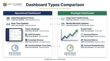
Operational Dashboards vs. Strategic Dashboards
Operational dashboards focus on daily management: today's bookings, staff schedules, equipment status, and immediate revenue. You check them several times a day to run current operations:
- Who's scheduled in the batting cages right now
- Which fields need maintenance prep before tonight's rentals
- Whether this afternoon's lesson payments have processed
Strategic dashboards focus on longer-term trends: month-over-month growth, seasonal booking patterns, customer retention rates, and program profitability. You review them weekly or monthly to guide planning:
- Whether to hire another instructor
- Which time slots need promotional pricing
- How this season compares to last year
Most facility operators need both views, but the metrics, update frequency, and design priorities differ significantly.
Essential Metrics Every Baseball Facility Dashboard Should Track
Utilization Rate by Field and Time Block
Calculate what percentage of available field hours are actually booked, broken down by specific field and time block. Field 1 might run at 82% utilization while your batting cages sit at only 45%. Weekday mornings might be 30% booked while weekend afternoons hit 85%.
This shows exactly where you're leaving money on the table and where to focus marketing or pricing adjustments.
A facility with 70% overall utilization sounds decent until you dig in: premium turf at 90% booked may need more capacity or higher prices, while outdoor diamonds at 40% empty on weekday afternoons need targeted promotions or different programming.
The calculation is straightforward: divide actual booked hours by total available hours for each space and time period. If your batting cage #1 is available 60 hours this week and booked for 27 hours, that's 45% utilization. Track this by:
- Space type: Indoor turf vs. outdoor diamond vs. batting cage
- Day of week: Monday through Sunday
- Time block: Morning (6 AM-12 PM), afternoon (12-6 PM), evening (6-10 PM)
- Customer type: Youth leagues vs. adult rentals vs. private lessons
Don't rely on a single facility-wide utilization number. Arlington's study documented that rectangular fields generated more rental revenue than diamond fields because diamonds were used mainly for paid district programs. Rental revenue alone didn't represent the full diamond economics. Granular tracking prevents this blind spot.
Revenue Per Available Hour
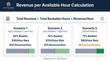
Track total revenue divided by total bookable hours across all spaces. This single number captures both utilization and pricing effectiveness.
A field might be 80% booked but low-revenue if it's all discounted youth leagues. Another could be 50% booked yet highly profitable with premium private training at $150 per hour.
Current baseball facility pricing varies significantly by location and service type:
- Fort Worth charges $60/hour for tournament baseball fields
- Raleigh charges $45/hour plus a $15 application fee, with nonresidents paying 25% more
- Mountain View charges $20 per half-hour for resident cage rentals and $25 for nonresidents
Revenue per available hour normalizes these differences. Calculate it weekly and monthly for:
- Each space (Field 1, Cage A, Indoor Turf)
- Each program type (leagues, private lessons, team rentals)
- Peak vs. off-peak time blocks
If your cages generate $15/hour during weekday mornings but $45/hour on weekend afternoons, you know exactly where to focus growth efforts or pricing experiments.
Booking Lead Time and Patterns
Monitor how far in advance customers book and which time slots fill first. Do most customers book two days out or two weeks out? Do weekend prime-time slots fill a month in advance while weekday mornings stay empty until the day before?
Understanding booking behavior helps you:
- Adjust pricing: Charge premium rates for last-minute weekend bookings that always sell out
- Optimize staffing: Schedule more instructors during peak booking windows
- Time marketing: Promote slow periods 2-3 weeks out when your data shows people are actively making decisions
Phoenix makes most lighted athletic fields bookable 4-10 PM weekdays and 8 AM-10 PM weekends; unlighted fields are available 4-6 PM. If your dashboard shows that 85% of weekend bookings happen more than two weeks in advance but weekday bookings cluster within three days, you'd run early-bird weekend promotions and last-minute weekday flash sales.
Track average days between booking and service date, broken down by time block, customer segment, and season. Spring training bookings might happen months ahead while fall practice rentals book within days.
Customer Retention and Repeat Booking Rate
Track what percentage of first-time customers come back for a second booking, and how many become regular weekly or monthly users. The Health & Fitness Alliance's 2025 benchmark reports 66.4% annual member retention across 175 companies and 17,000+ fitness facilities in 27 countries. Treat that as an adjacent-industry comparator, not a baseball-specific benchmark.
New customers cost more to win than existing ones cost to keep, so facilities that skip retention metrics keep spending on acquisition while repeat business quietly drops. Dashboard metrics should include:
- First-to-second booking conversion: percentage of new customers who return
- 30-day retention: customers who book again within 30 days
- Active customer count: unique customers with bookings in the last 90 days
- Booking frequency: average bookings per customer per month
Segment these by customer type. A youth league that renews annually looks very different from private lesson clients who should book weekly. If only 25% of trial lesson customers ever book a second session, your conversion process needs attention more than your marketing does.
Staff Utilization and Revenue Per Instructor
Monitor which instructors are fully booked vs. underutilized, and calculate revenue generated per instructor hour. This reveals both capacity issues and performance patterns.
If your top instructor is booked 35 hours per week while two others average 12 hours, you have a capacity problem. Customers want that instructor but can't get appointments, so they wait, leave, or take a less-preferred alternative.
Hire additional high-demand instructors, adjust schedules, or raise prices to rebalance demand.
Revenue per instructor hour shows performance beyond just booking volume. One instructor might teach 20 hours per week of $40 group clinics ($800 revenue) while another teaches 15 hours of $100 private lessons ($1,500 revenue). Both are valuable, but the revenue contribution differs.
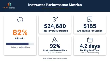
Track for each instructor:
- Booked hours vs. available hours: utilization percentage
- Total revenue generated: from all lessons, clinics, and programs
- Average revenue per session: indicates pricing tier and service mix
- Customer request rate: how often customers specifically request that instructor
- Booking lead time: how far in advance they fill up
These metrics inform hiring decisions, schedule adjustments, pricing changes, and professional development priorities.
Payment Collection and Outstanding Balance
Track percentage of bookings paid upfront vs. invoiced later, average time to collect payment, and total outstanding receivables. Cash flow problems kill facilities faster than low bookings. A fully booked schedule means nothing if 30% of revenue sits uncollected in invoices.
The Federal Reserve's 2024 small business survey found that 38% of firms collect payment in full at service or purchase, while 28% collect after delivery via invoice. About 80% of small businesses face payment challenges, with slow-paying customers being the most common issue for those using post-delivery payment models.
Your dashboard should separate upfront bookings from invoiced balances:
- Prepaid booking percentage: how many reservations are paid before service
- Outstanding invoice total: current receivables owed
- Average days to payment: for invoiced bookings
- Aged receivables: invoices 30, 60, and 90+ days overdue
- Collection rate: percentage of invoices paid within terms
Facilities that require upfront online payment for rentals but invoice monthly for league play will see very different collection patterns. Monitor both to identify where payment friction or policy changes might improve cash flow.
Dashboard Design Principles for Baseball Facilities
Prioritize Actionable Metrics Over Vanity Metrics
Design dashboards around metrics that directly inform decisions. Utilization by time slot suggests when to offer promotions. Instructor booking rates suggest when to hire. Outstanding receivables over 60 days trigger collection calls.
Vanity metrics look impressive but don't change behavior. Keep them out of operational dashboards:
- Total lifetime bookings
- Cumulative revenue since opening
- Total square footage
- Years in business
Those belong in investor presentations.
Test every dashboard metric with this question: "If this number changed significantly, what specific action would I take?" If you can't answer clearly, remove that metric from your primary view.
Examples of actionable metrics:
- Weekday morning cage utilization at 28% → Launch $15 off-peak promotion
- Instructor Sarah booked 38 of 40 available hours → Begin hiring process
- $12,400 in invoices over 60 days → Call those customers today
- Only 19% of trial lesson customers rebook → Revise follow-up process
Use Visual Hierarchy to Guide Attention
Place the most critical real-time metrics at the top in larger, high-contrast elements. Supporting details and historical trends can sit below.
Facility managers checking dashboards between coaching sessions need critical information in five seconds, not buried in menus.
According to the Nielsen Norman Group, bar length and 2D position support rapid quantitative comparison. Ordered bars make values easier to compare. Use color as a secondary grouping cue, not as the sole representation of magnitude or category.
Avoid for rapid operational reading:
- Pie charts and donut charts (require mental calculation)
- Gauges and dials (take up excessive space for minimal information)
- 3D charts (distort values and slow interpretation)
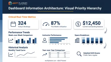
Design hierarchy:
- Top section (above the fold): Today's bookings, this week's utilization, current outstanding balance
- Middle section: Week-over-week trends, instructor performance, space utilization breakdown
- Bottom section: Monthly trends, historical comparisons, detailed drill-downs
Use size, position, and contrast to guide eyes naturally from most to least time-sensitive information.
Implement Role-Based Dashboard Views
Different users need different information. A front desk staff member needs today's schedule and payment status. An instructor needs their personal schedule and student notes. A manager needs utilization trends and revenue forecasts.
Build separate dashboard views tailored to each role rather than forcing everyone into one generic view. Research on dashboard usability confirms that occupational role and context influence which data elements, visualizations, and interactions users need.
Front desk view priorities:
- Today's and tomorrow's bookings by time
- Customer check-in status
- Outstanding payments due today
- Equipment or field prep requirements
Instructors need a tighter slice of the same system.
Instructor view priorities:
- Personal schedule for today and this week
- Client contact information and session notes
- Availability calendar for accepting new bookings
- Personal revenue and commission tracking
Managers need the facility-wide picture.
Manager view priorities:
- Utilization by field and time block
- Revenue trends and month-to-date totals
- Staff utilization and hiring needs
- Outstanding invoices and cash flow
- Booking pace vs. historical patterns
Each role sees only the metrics they can act on, so the dashboard stays useful instead of noisy.
Enable Drill-Down from Summary to Detail
Design dashboards so managers can click on a summary metric to drill into specifics, then drill further into granular detail. Decisions require understanding the "why" behind the numbers.
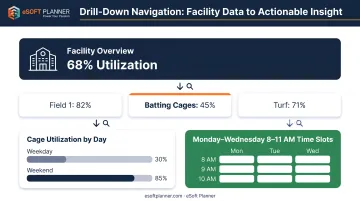
Example drill-down path:
- Summary: Overall facility utilization at 68%
- Click to drill: Field 1 at 82%, batting cages at 45%, turf at 71%
- Click cage details: Cages are 85% booked weekends but only 30% weekday mornings
- Click weekday morning: Most empty slots are Monday-Wednesday 8-11 AM
Now you know exactly where the problem is and can launch a targeted weekday morning promotion for those specific time slots.
That path turns a vague 68% utilization figure into a clear next step: a $15 discount promotion for Monday-Wednesday morning batting cages.
Common Dashboard Mistakes and How to Avoid Them
Tracking Too Many Metrics at Once
Many facility operators build dashboards with 20+ metrics visible at once. Nothing stands out, and critical patterns disappear in the clutter.
Research with 56 participants found that users became overwhelmed at nine or more information modules. The study used a construction-dashboard context and is preliminary, but the overload threshold still applies to facility operators.
Limit your primary dashboard view to 6-8 core metrics. Additional details should be accessible through drill-down or secondary tabs, not cluttering your main view.
How to prioritize your core 6-8 metrics:
- List every metric you currently track
- Ask for each: "Do I check this at least weekly?"
- Ask: "Does this directly drive a decision or action?"
- Rank by importance and frequency of use
- Move lower-ranked metrics to secondary tabs or monthly reports
If a metric is important quarterly but not weekly, it doesn't belong on your daily operational dashboard.
Ignoring Context and Benchmarks
Showing "68% utilization" means nothing without context. Is that good or bad? Up or down from last month? Above or below your target?
Always pair metrics with comparison context and visual indicators that make performance obvious at a glance. The Nielsen Norman Group emphasizes that numbers require comparison context, such as prior periods, targets, or comparable groups.
Add context through:
- Historical comparison: "68% utilization (↑ from 61% last month)"
- Target comparison: "68% utilization (↓ below 75% target)"
- Year-over-year: "68% utilization (↓ from 73% same week last year)"
- Visual indicators: Green for above target, yellow for slightly below, red for significantly below
No authoritative national baseball facility benchmarks exist for utilization, revenue per hour, retention, or collection days. Use your own historical data, planned capacity, budget targets, and clearly matched local comparators. Never label those figures "industry averages."
Using Dashboard Data Without Taking Action
The biggest dashboard mistake is failing to act. You pull up the dashboard daily, see that weekday morning batting cage utilization is only 30%, and do nothing about it.
Establish specific thresholds and actions tied to dashboard metrics:
- If field utilization drops below 40% → Trigger discount promotion for that time block
- If instructor bookings exceed 85% → Begin hiring process for additional staff
- If outstanding invoices exceed $10,000 → Dedicate Friday morning to collection calls
- If first-to-second booking rate drops below 35% → Review and revise follow-up email sequence
Dashboards show you problems in real time. You still have to solve them.
Choosing Dashboard Features for Your Facility
Match Dashboard Complexity to Facility Size and Needs
A single-field facility with two instructors needs a simple dashboard focused on daily bookings and weekly revenue. A 10-field complex running youth leagues, adult rentals, private lessons, and camps needs dashboards that track utilization by space type, program profitability, staff allocation, and customer segments.
Official facility examples range widely:
- Botetourt, Virginia: 4 championship youth baseball/softball fields supporting lighting and tournaments
- Murfreesboro, Tennessee: 8 fields segmented among ages 9-12, 13+, tee ball, coach pitch, and softball
- Chickasha, Oklahoma: 15 ballfields (8 softball, 5 baseball, 2 tee-ball) supporting games, tournaments, and rentals
Choose dashboard features that fit your operational complexity, not what impresses in a demo. A four-field facility doesn't need league-division scheduling and tournament bracket management. A 15-field complex can't survive on a simple calendar view.
Prioritize Real-Time Updates Over Manual Report Generation
Dashboards that require someone to manually export data, import it, and refresh reports are not real-time tools. Look for facility management software where dashboards automatically update as bookings happen, payments process, and schedules change.
Real-time updates give you current information without any staff time investment. You can check utilization, revenue, and booking pace between lessons or during your morning coffee, confident the numbers reflect what's actually happening right now.
Manual report generation turns a dashboard into just another report: static, time-consuming, and usually outdated by the time you review it. When evaluating software, ask specifically: "Do dashboard metrics update automatically when a customer books online, or does someone need to refresh or regenerate the dashboard?"
Evaluate Integration with Your Existing Systems
The most useful dashboards pull data from scheduling, payments, your customer database, instructor management, and equipment tracking into one view. That only works if the dashboard connects cleanly to those systems.
Research whether dashboard software integrates with your current booking platform, payment processor, and CRM. If you're using separate systems for scheduling, billing, and customer management, you'll spend significant time manually consolidating data or accepting incomplete dashboard visibility.
Alternatively, consolidate onto one integrated system so you are not stitching reports together by hand.
eSoft Planner combines scheduling, payments, customer management, and reporting in one platform built for schedule-based businesses like baseball facilities. Plans start at $39/month with a-la-carte modules, so you pay only for what you use:
- Lessons, rentals, and camps
- Memberships and team management
- Access control
Core dashboard, client management, and reporting tools are included on every plan. With operations in one system, bookings, payments, and customer activity feed the dashboard without manual data transfers.
Frequently Asked Questions
What metrics should a baseball facility dashboard track?
Track utilization by field and time block, revenue per available hour, booking lead time, and customer retention. Those four show where you're leaving money on the table, whether pricing is working, and if acquisition spend turns into repeat business.
How often should I check my facility dashboard?
Spend about five minutes daily on today's bookings and this week's utilization. Do a 30-minute weekly review for trends, pricing, and marketing, plus a 1–2 hour monthly session with leadership to set the next period's goals.
What's the difference between real-time and historical dashboard data?
Real-time data covers current bookings, today's revenue, and this week's utilization so you can adjust staffing or run same-day promotions. Historical trends support longer calls like hiring and seasonal pricing; put live metrics on top and trends below for context.
Can I customize my facility management dashboard?
It depends on the software. Some tools let you drag and drop metrics; others stick to fixed layouts. In demos, confirm you can add, remove, and rearrange widgets to match how your facility actually runs.
How do I know if my dashboard is showing the right data?
Keep a metric only if it answers a weekly question you actually ask and drives an action, such as adjusting price or staffing. If it doesn't change a decision, move it off the primary view into a secondary report or monthly review.
What dashboard features are most important for profitability?
Prioritize alerts for open prime-time slots, filters by field or program, and simple export for monthly reviews. Those features turn utilization and revenue data into pricing, promo, and staffing decisions instead of static charts.